At St. Luke’s Children’s Pavilion, each floor required a cohesive theme to enhance the environment. Working with the two colors chosen by CHSQA for each floor, I developed a concept that addressed an often-overlooked area: the elevators.
I designed a striking 10-foot by 30-foot set of illustrations inspired by 1960s architectural sketches, incorporating straight lines, vibrant colors, and airbrush textures. The result was a series of unique, colorful, modern, and friendly illustrations that transformed the elevator spaces.
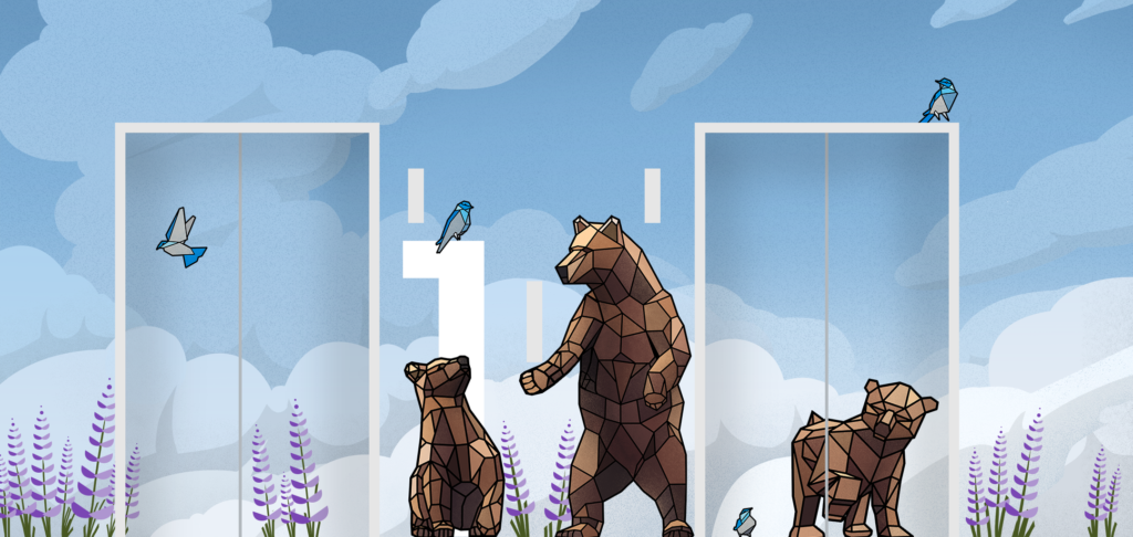
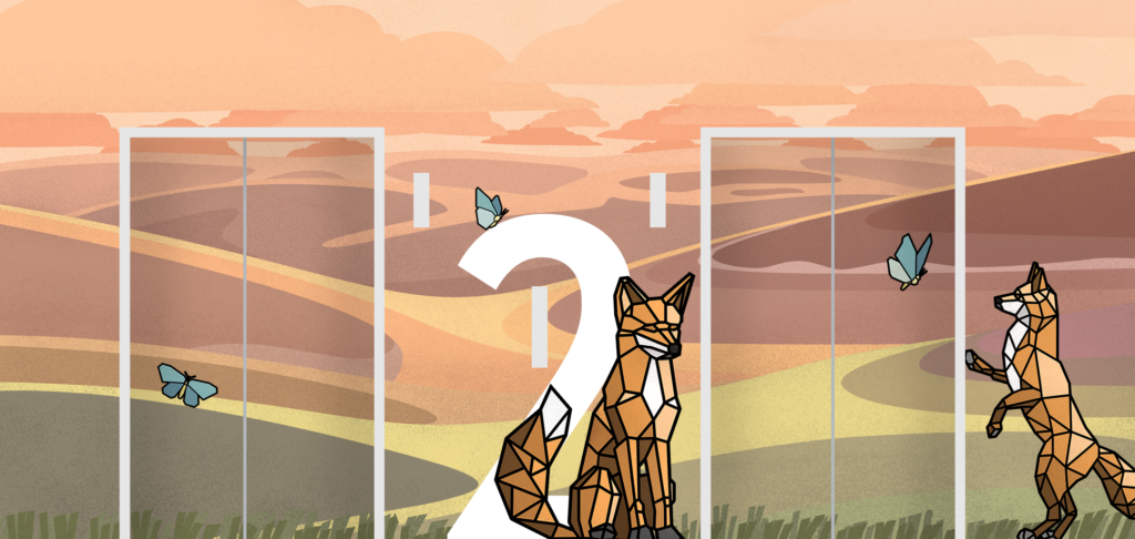
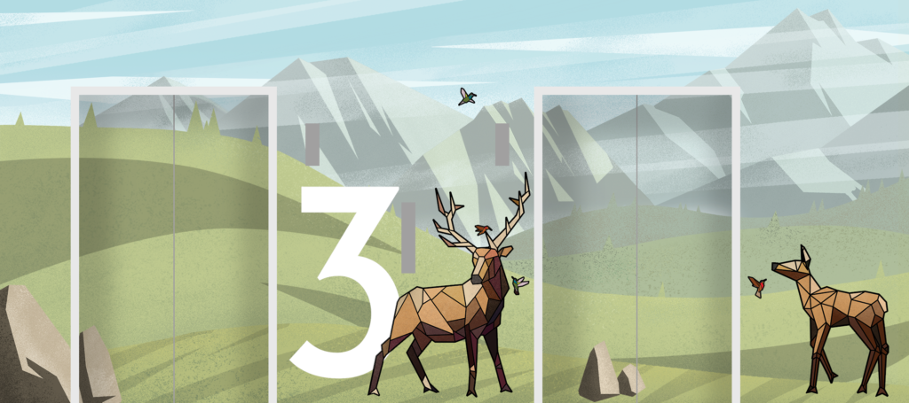
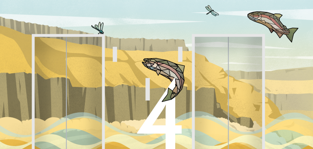
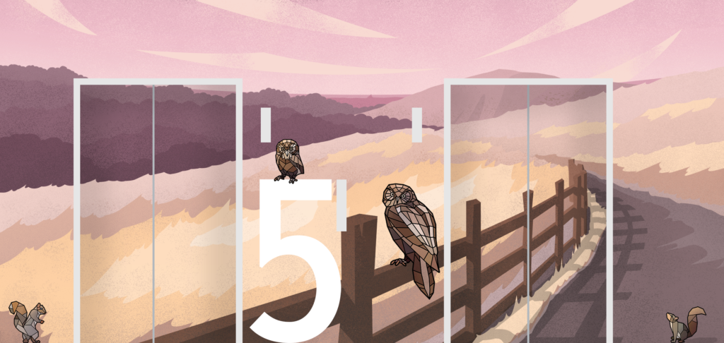
All elevator areas were printed on high-durability laminate, ensuring a 10-year colour guarantee, while the elevator doors featured vinyl with a durable motorcycle laminate. To withstand the demands of a hospital environment, the panels were constructed with exterior finishes to endure bumps from gurneys. Additionally, I ensured that each panel could be easily replaced if necessary.
The redesigned elevators now serve as a warm welcome for patients, offering a playful distraction for children as they wait to see their doctors. The animal motifs are also integrated throughout the wayfinding signage and hidden in the play structures, creating a cohesive experience.
A key highlight of the floor branding was the massive first-floor bird light sculpture. Designed to resemble flowing wind, this captivating feature guides patients from the parking garage to the front desk. With over 200 dichroic birds attached to the light, it provides a stunning visual entrance. The RGB LEDs within the sculpture transition at ‘half walking speed,’ fading from white to blue, simulating the movement of clouds overhead.

